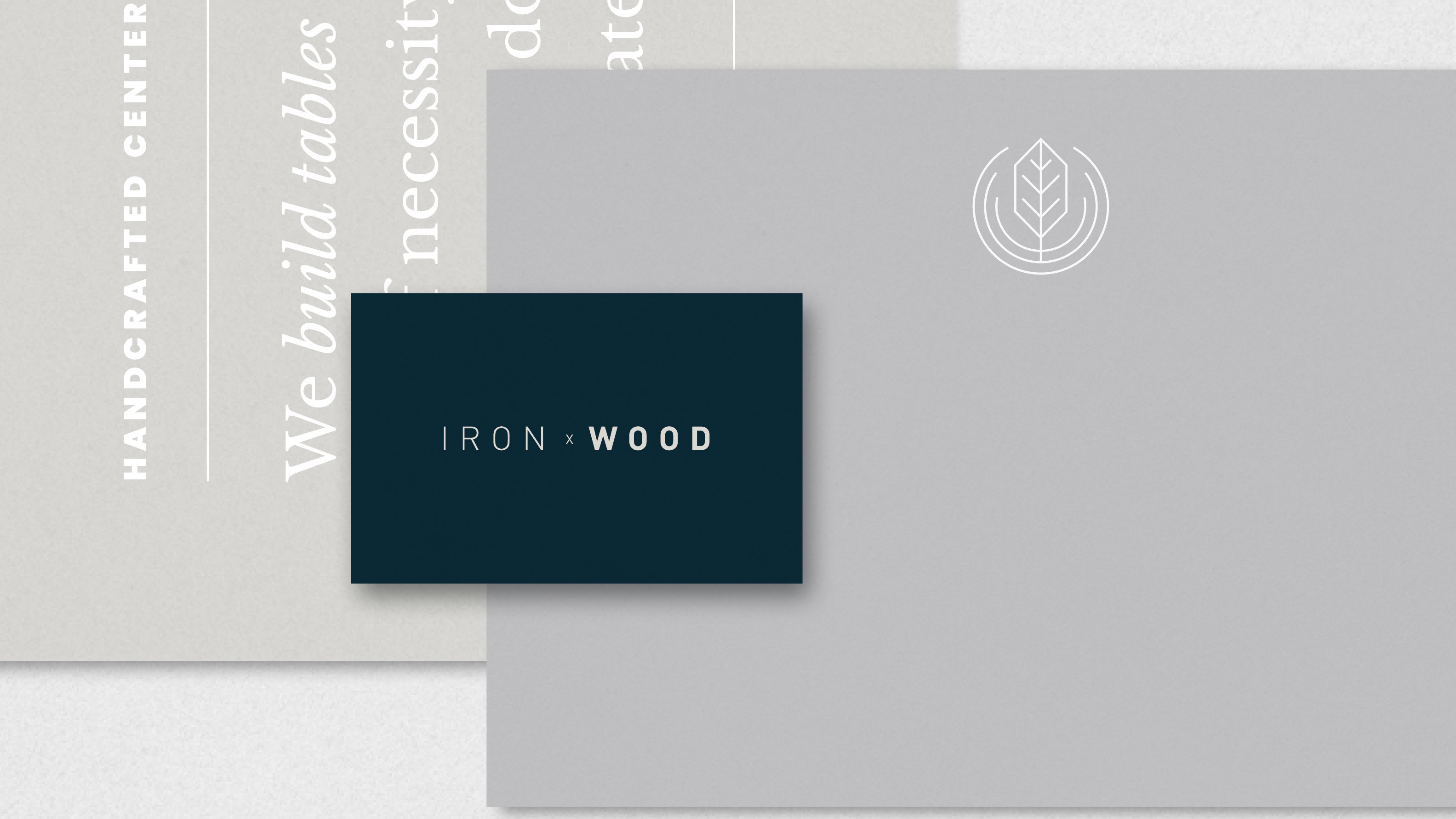
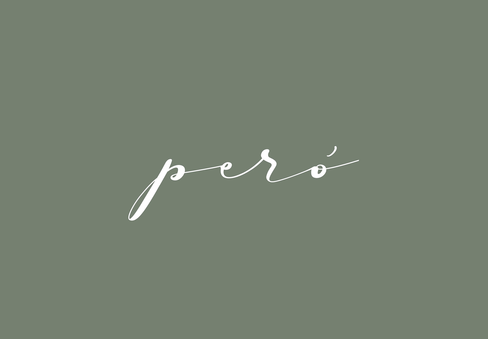
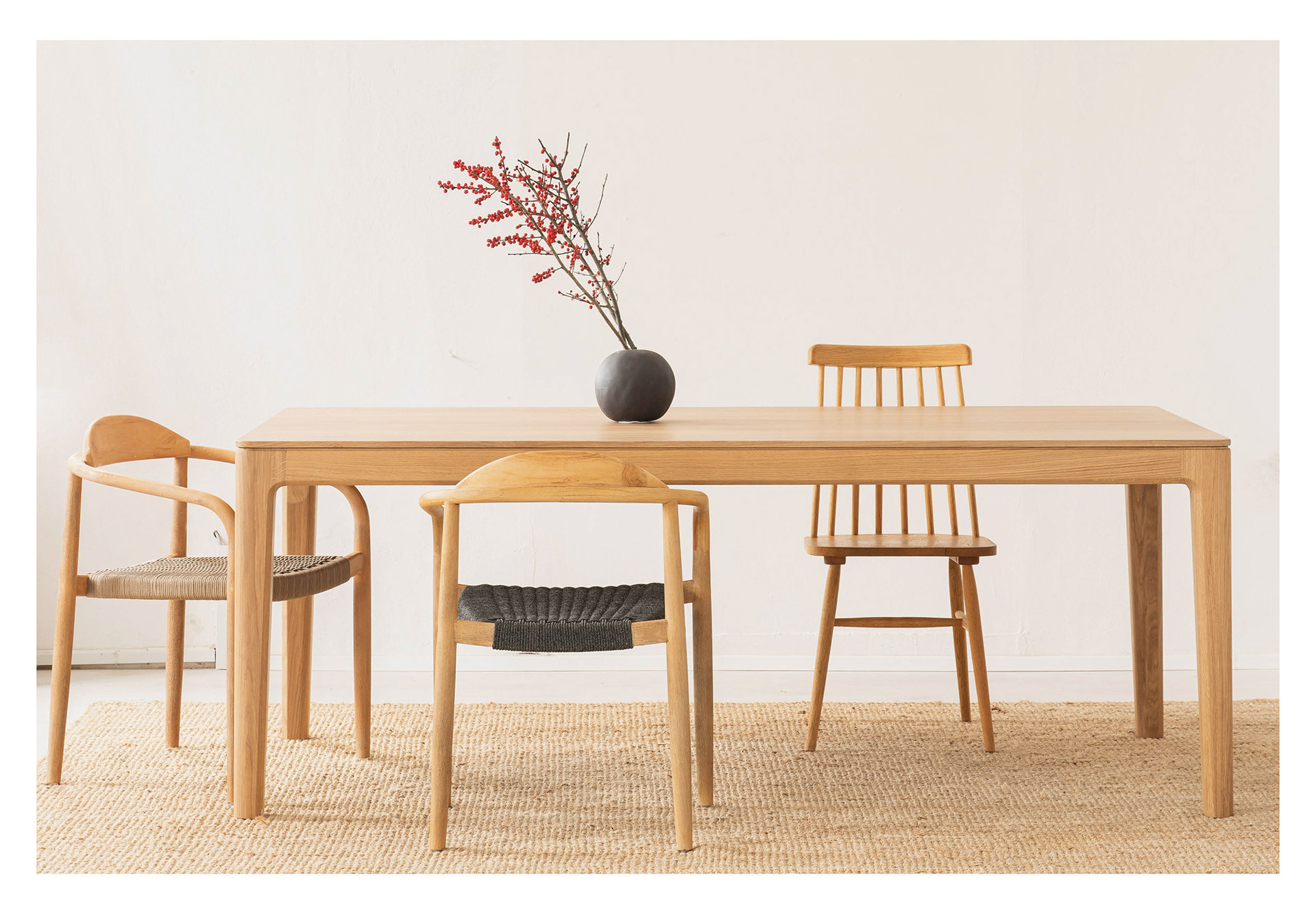
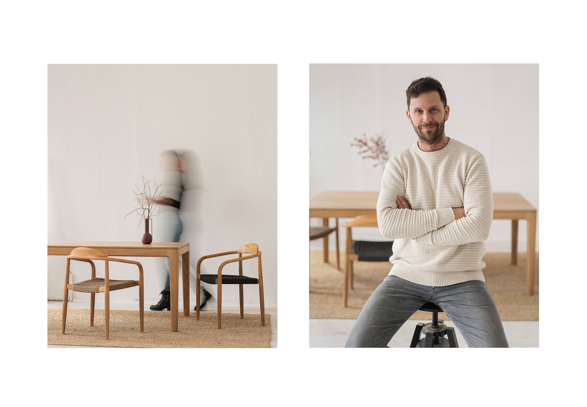
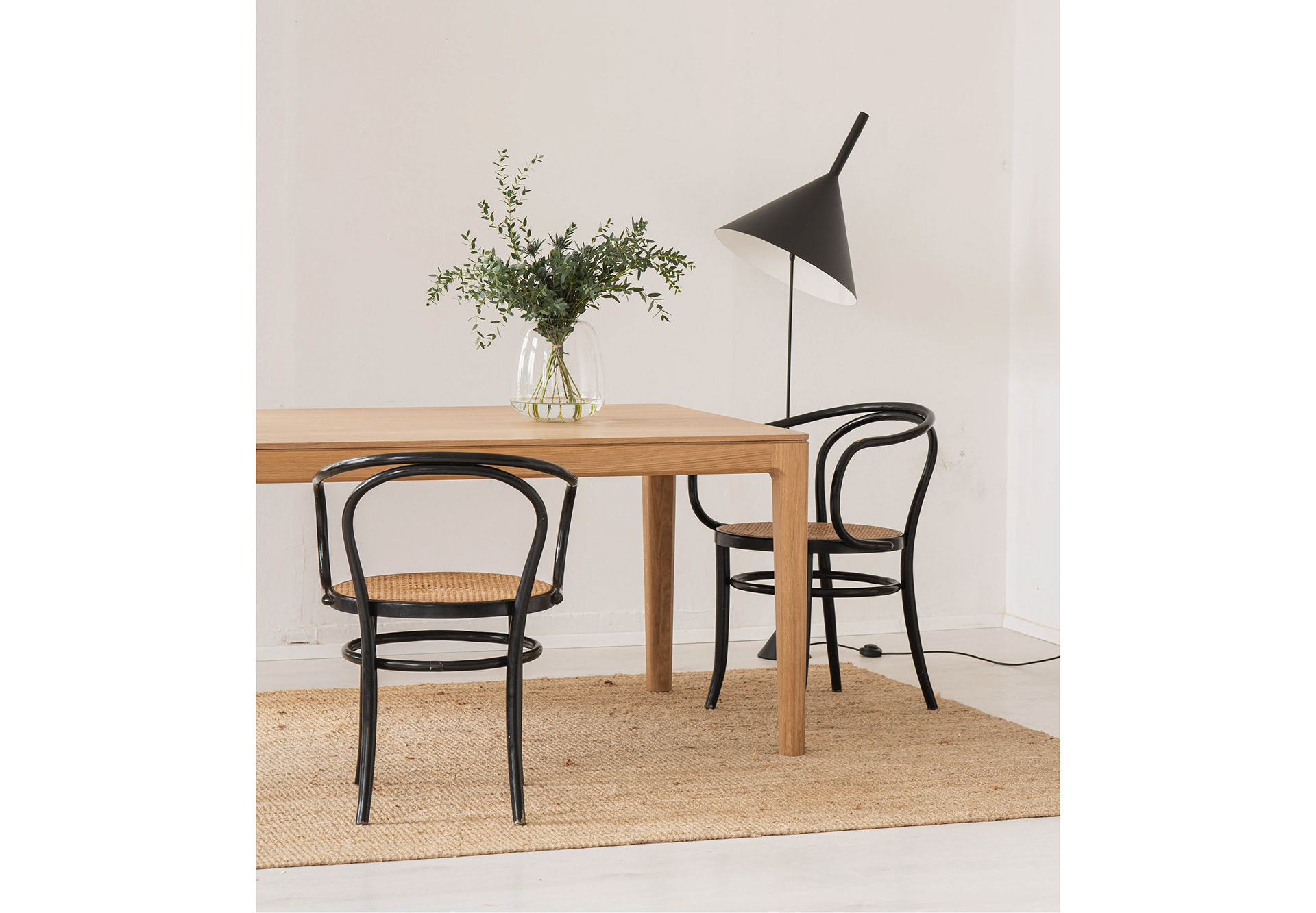
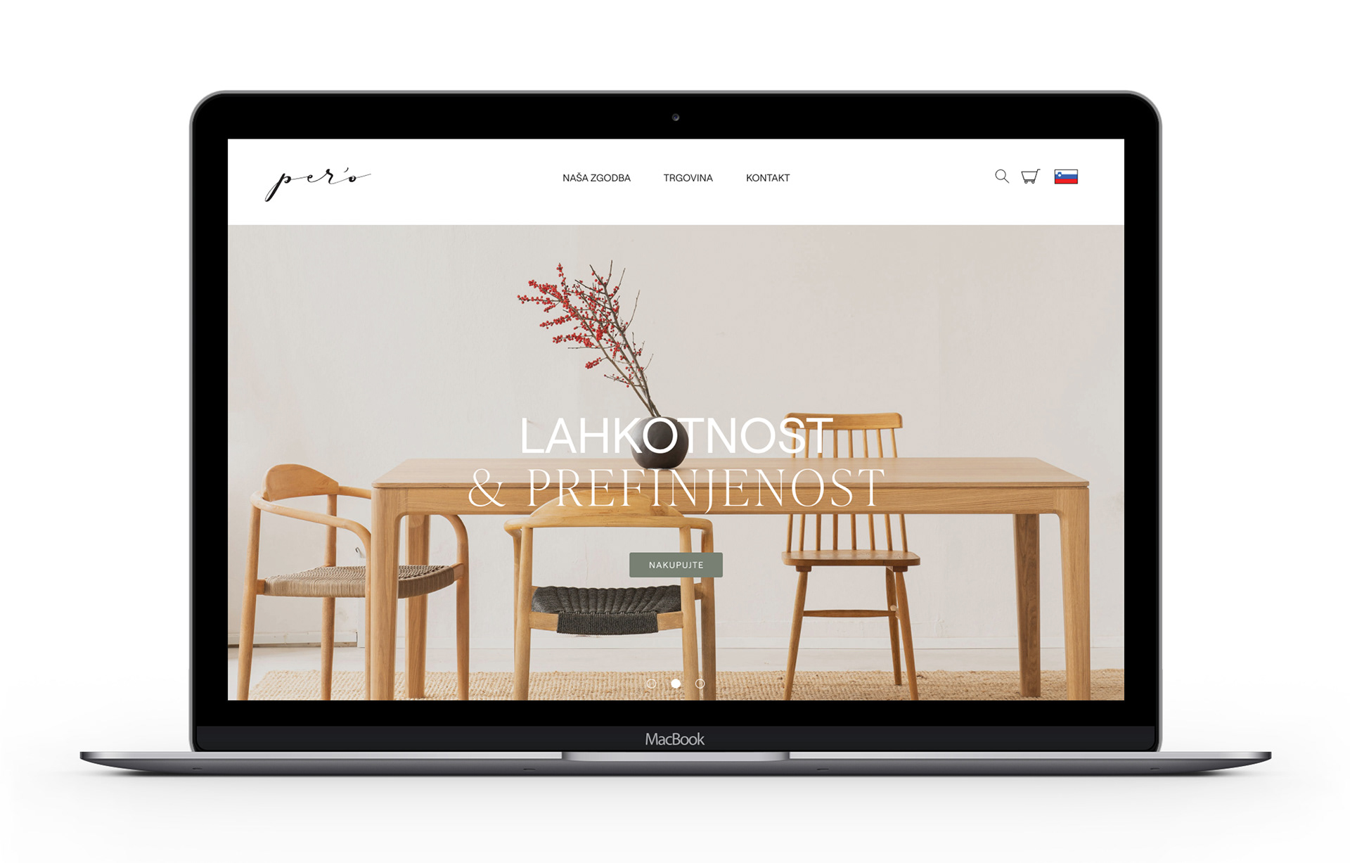
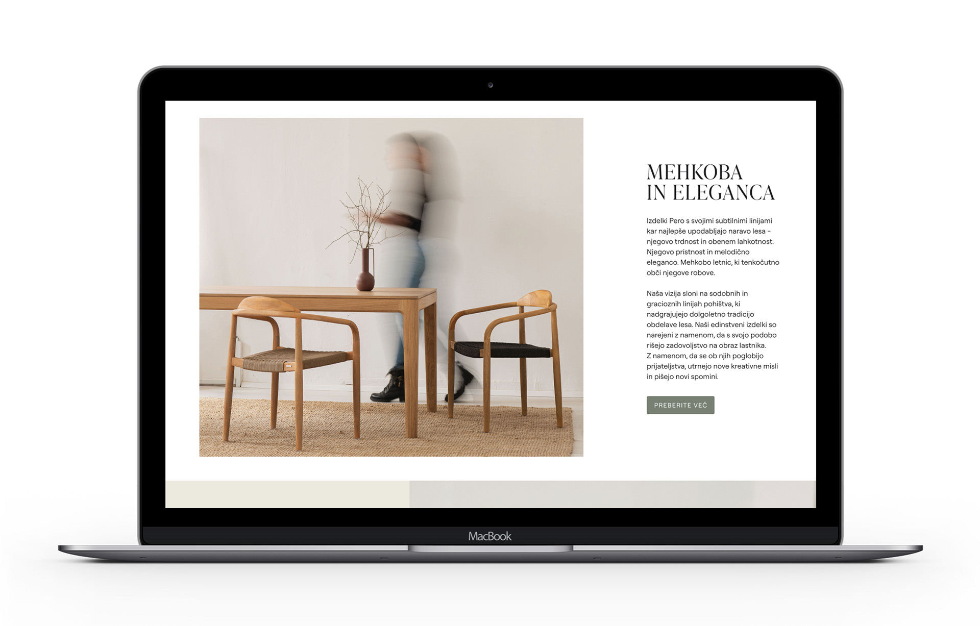
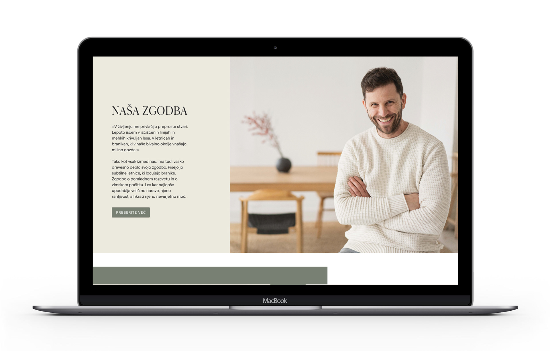
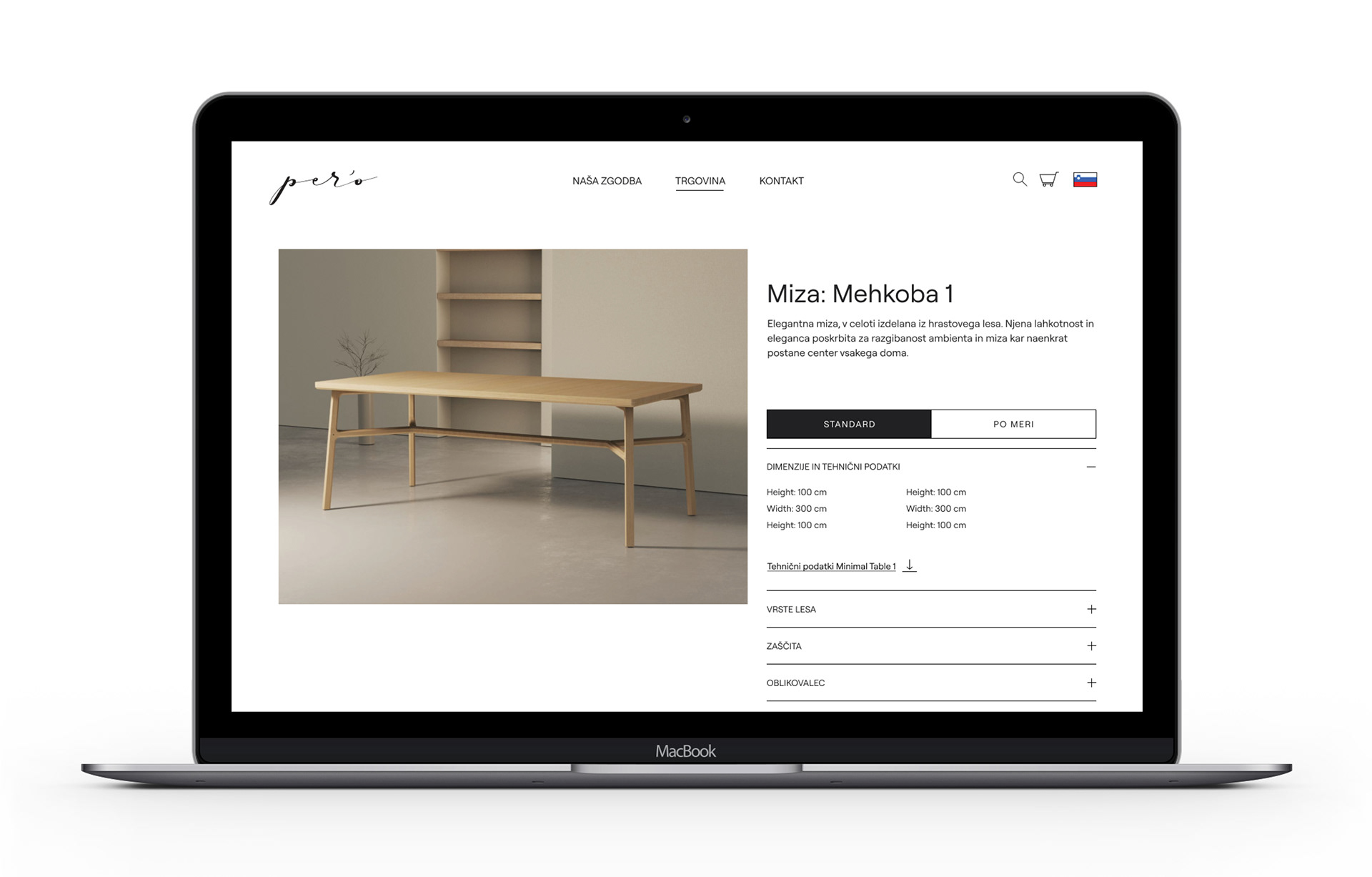
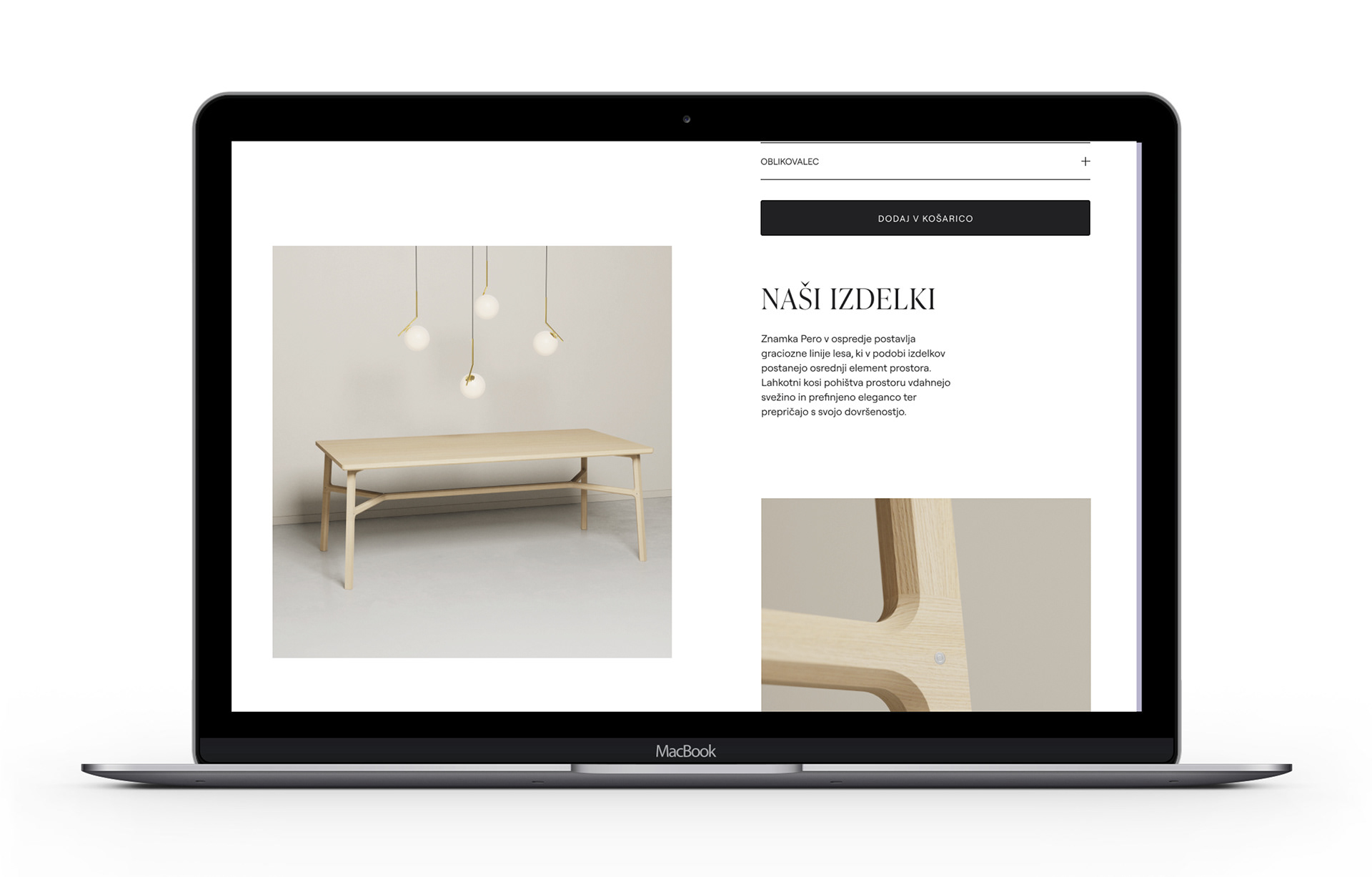
Peró is a Slovenian brand of solid wood tables that combines a long tradition of wood processing with modern technological approaches.
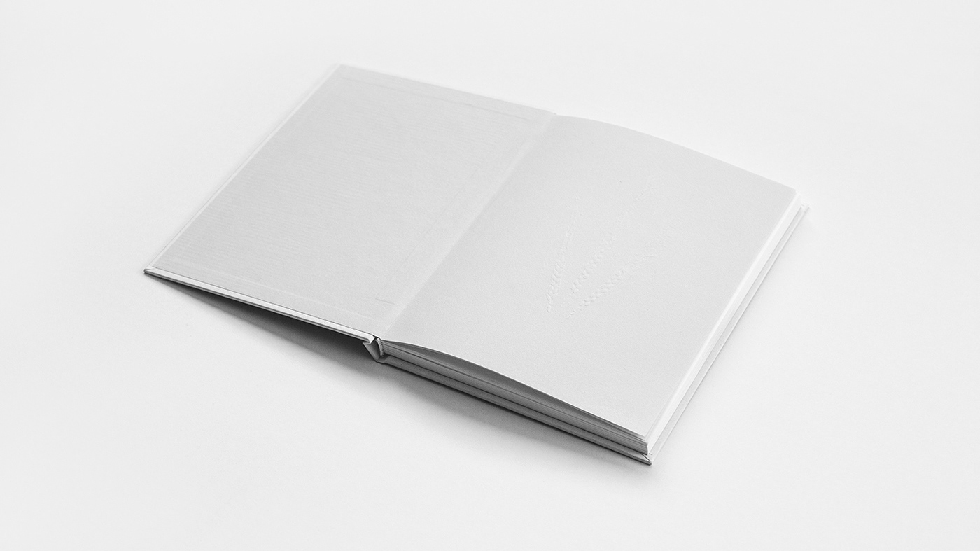
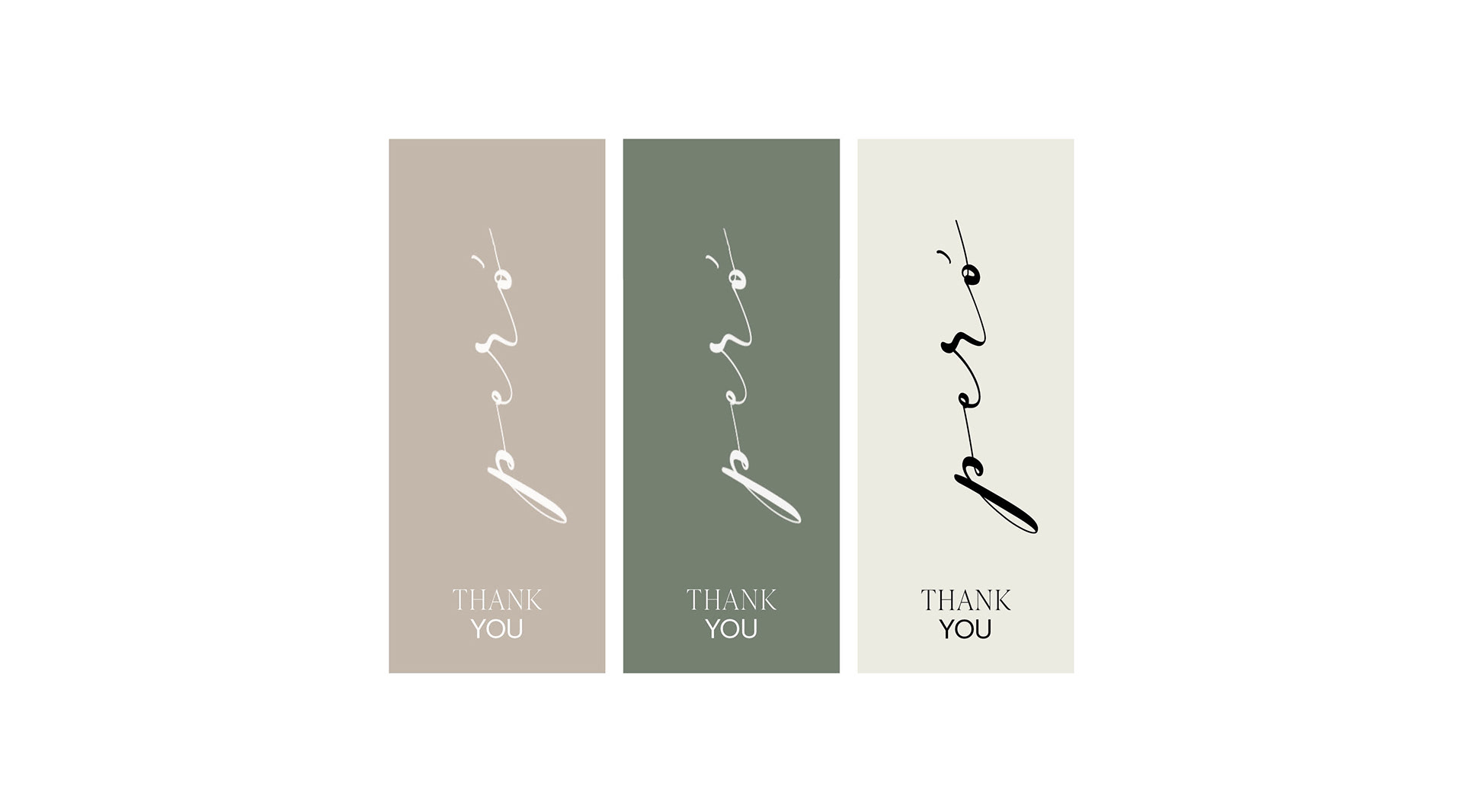
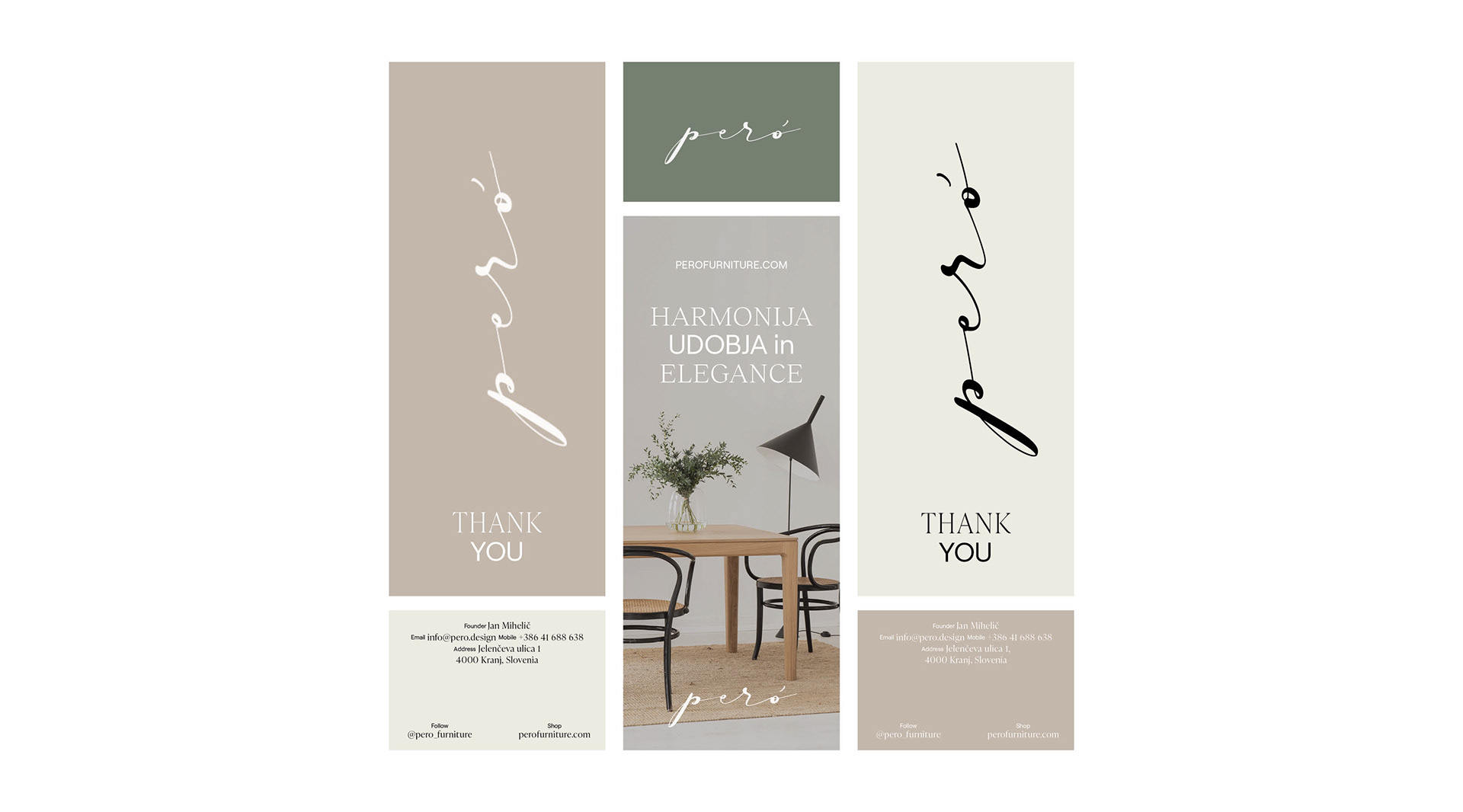
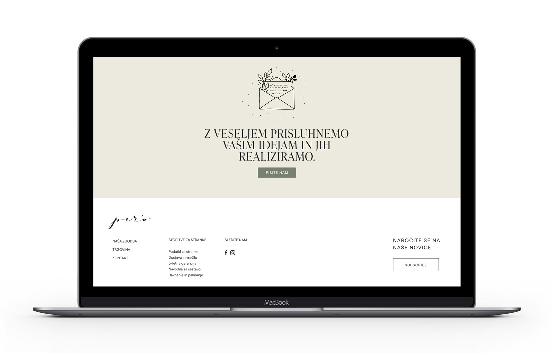
Visual identity draws inspiration from nature. Soft, natural colours represent brand's dedication to sustainability and products made from natural materials. A combination of serif and sans serif fonts joins elegance with simplicity, two of the brand's most prominent values. A logo created through modern calligraphy seamlessly combines traditional and contemporary elements, embodying a unique fusion that mirrors the brand's distinctive identity. The use of calligraphy imparts a timeless and artisanal quality, evoking a sense of tradition, craftsmanship, and a human touch. Simultaneously, the modern twist in the calligraphy introduces a fresh and current aesthetic, aligning the logo with the timeless and elegant outlook of the brand's products.


Client: peró
Art direction and design: Vida Iglicar
Art direction and design: Vida Iglicar
Photographer: Matic Lipar